
How we look
Minimal & unexpected, with a touch of fresh & vibrant. Simple on a screenshot, full of character in the details.
The intent
Mostly white,
flashes of lime.
Simplicity at first glance. Depth in every detail.
The toolkit
Six building blocks.
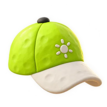
The formula
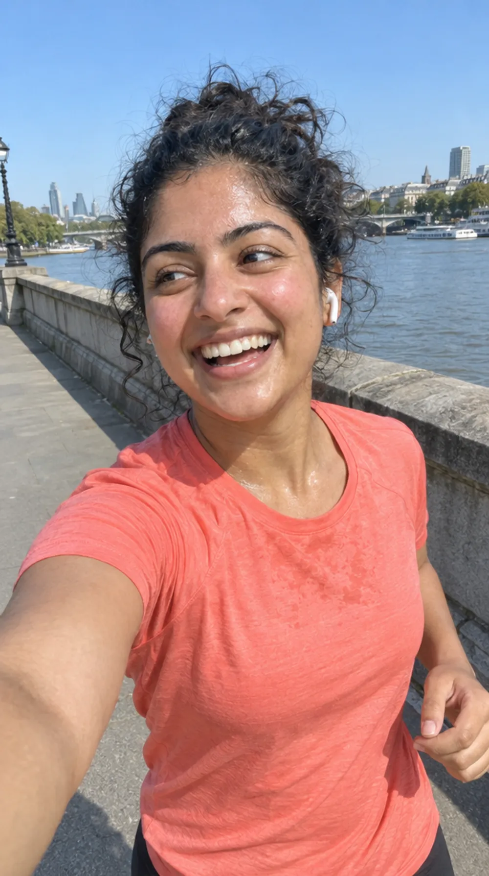
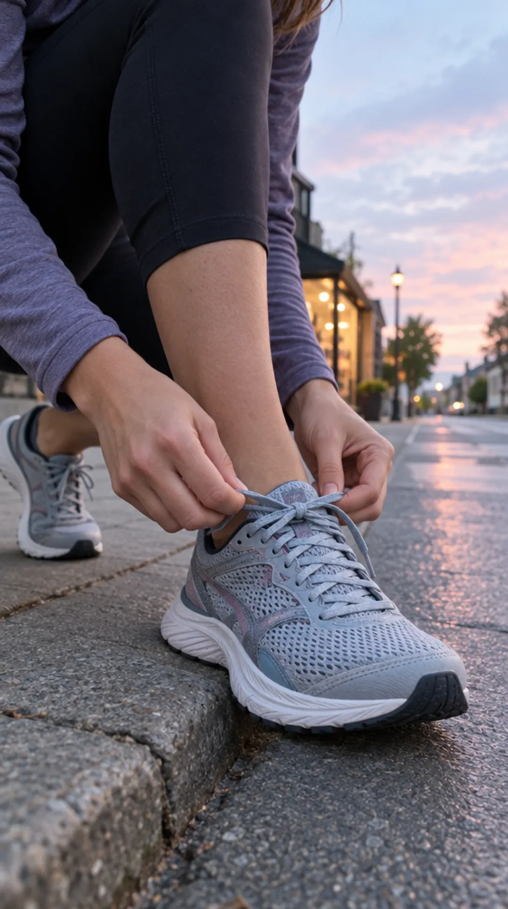
Raw photo. Refined design. Playful personality.
- A true running moment or one strong visual detail.
- A short headline, funny or complicit.
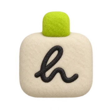
- A small brand sign, if needed: the Living h or the full logo.
- Lots of space. One main idea.

Always / never
What holds everything together.
Always
- Lots of white space.
- Little text per screen, one obvious priority.
- Calm editorial composition, clear hierarchy.
- Big, bold type in chosen places.
- Original navigation only if it stays intuitive.
- Subtle, intentional textures and details.
- Organic, living shapes. No gratuitous decoration.
- Premium but warm, open to every runner.
Never
- Big lime fills everywhere by default.
- Generic fitness UI, huge busy dashboards, competition everywhere.
- Glassy, glossy, “AI glow” effects to look premium.
- Gradients everywhere, neon, gratuitous blur, rubbery 3D on the symbol.
- Piles of cards, pills, text and little decorative illustrations.
- Experimental navigation that slows you down mid-run.