Logo
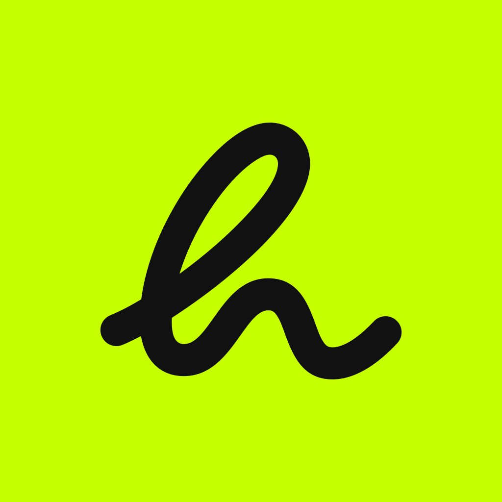
One little h. A whole lot of personality. The Living h and the word Hearun live together or apart, never retouched.
Two forms
The h alone, or the full logo.

The Living h
When the brand is already named or space is short: app icon, avatar, favicon, motion, watermark, a small sign in a layout.

The full logo
When the brand has to name itself: launch screen, website, store, campaign, document, signature, partners.
Construction
One continuous stroke.
- Drawn from the founder's own gesture: oblique attack, big loop, diagonal stem, round foot, arch, rising exit.
- One crossing. Its corners are the only angles in the logo.
- Round ends, always. No pinching anywhere.
- In the full logo, the word is Hanken Grotesk Bold, −0.01 em. The arch of the h sits at the word's x-height, the foot on its baseline, 0.18 em apart.
Constant · default

Organic · editorial, like pen pressure
Clear space: the word's x-height on all four sides, added in the layout, never baked into the file.
Colourways
Same shape. Adaptive colour.
Graphite
Light, off-white and lime backgrounds

Lime h, off-white word
Graphite and dark backgrounds

Off-white
Photos and dark non-graphite backgrounds

Lime
Dark backgrounds, occasional use
Misuse
Please don't.
 hearun
App icon
Graphite h. Lime square.
The icon can be louder than the screens inside the app. Exports for every iOS size are in the logo pack, plus dark and tinted variants (not validated yet).