
← How we lookSoft, squishy,
Soft, squishy,
slightly cheeky.
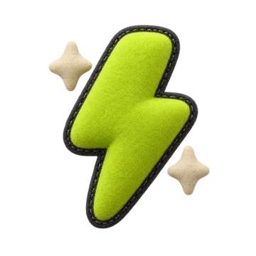
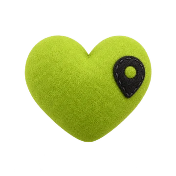
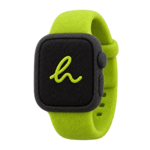
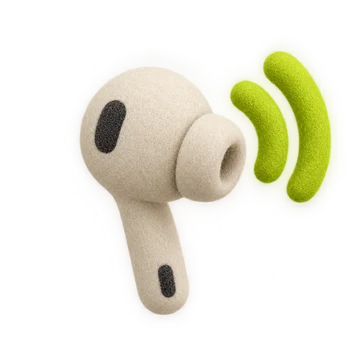
Our illustrations look like felt toys you want to pick up. They bring the joy around the product, never inside the logo.
The style
What makes it ours.
Felt & plush
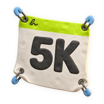
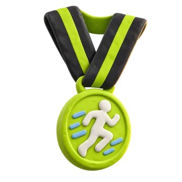
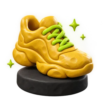
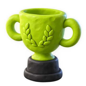
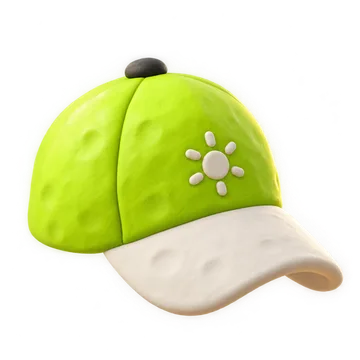
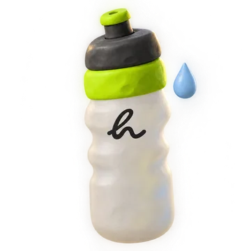
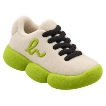
A soft, fuzzy 3D texture with gentle light. Toy-like, never glossy or plastic.
Our palette
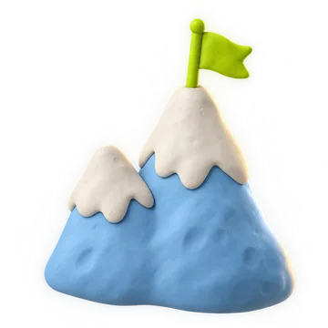
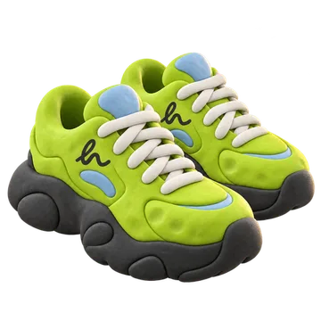
Lime, off-white and graphite. Sky blue or gold only where it means something: a snowy peak, a golden shoe.
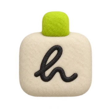
The stitched h
Objects carry a small graphite Living h, like an embroidered label.
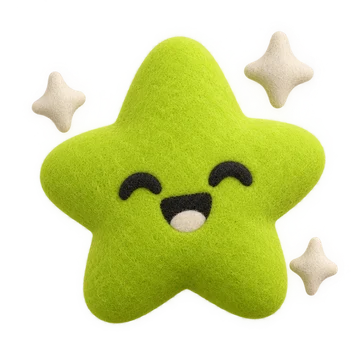
A little face
Symbols like the star can smile. Keep faces simple: dot eyes, small mouth, lime cheeks.
Achievements
Things worth collecting.
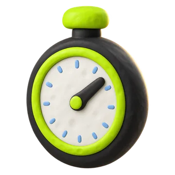
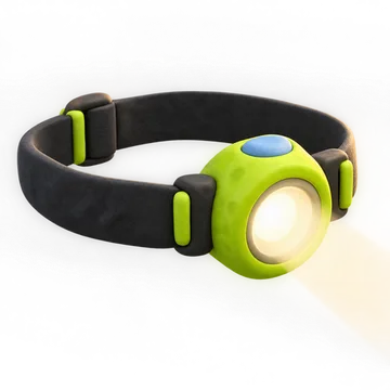
Every runner fills their profile with these. Each one is earned, so each one gets to feel a little precious.
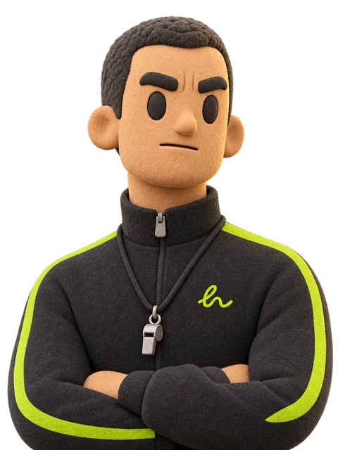
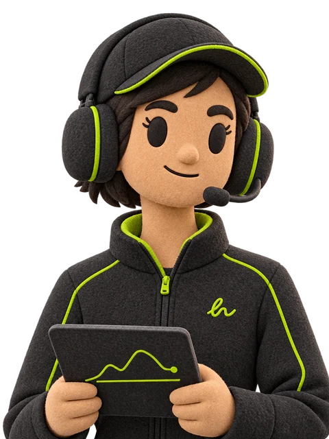
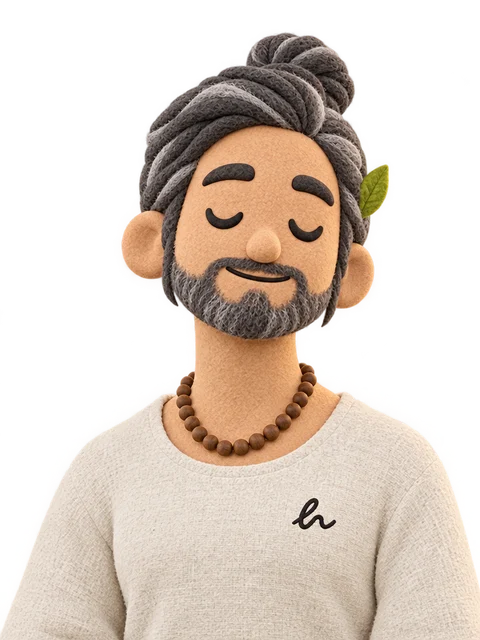
Characters
The coach crew.
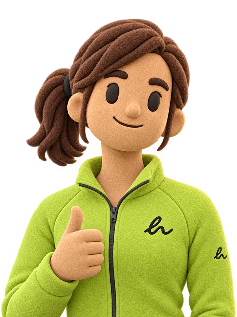
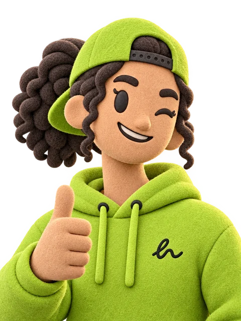
Same felt world, as people. Lime and graphite kit, a stitched h on the chest.
Use it well
Around the product. Never instead of it.
Look who's back.

Observed, not yet validated. This style comes from what ships on hearun.app today; it is not written in the brand system yet. Confirm it, then add it to docs/BRAND.md.
Every sticker and character, in full resolution, is in the asset library.